I'm a product designer who loves to create using code.


How do you hire the right people at scale? A platform for identifying star talent using 33 second video pitches.
Read Case Study
Capture the best ideas and increase employee agency with a digital suggestion box for mid-sized enterprises. A product design and front-end development project.
Read Case Study
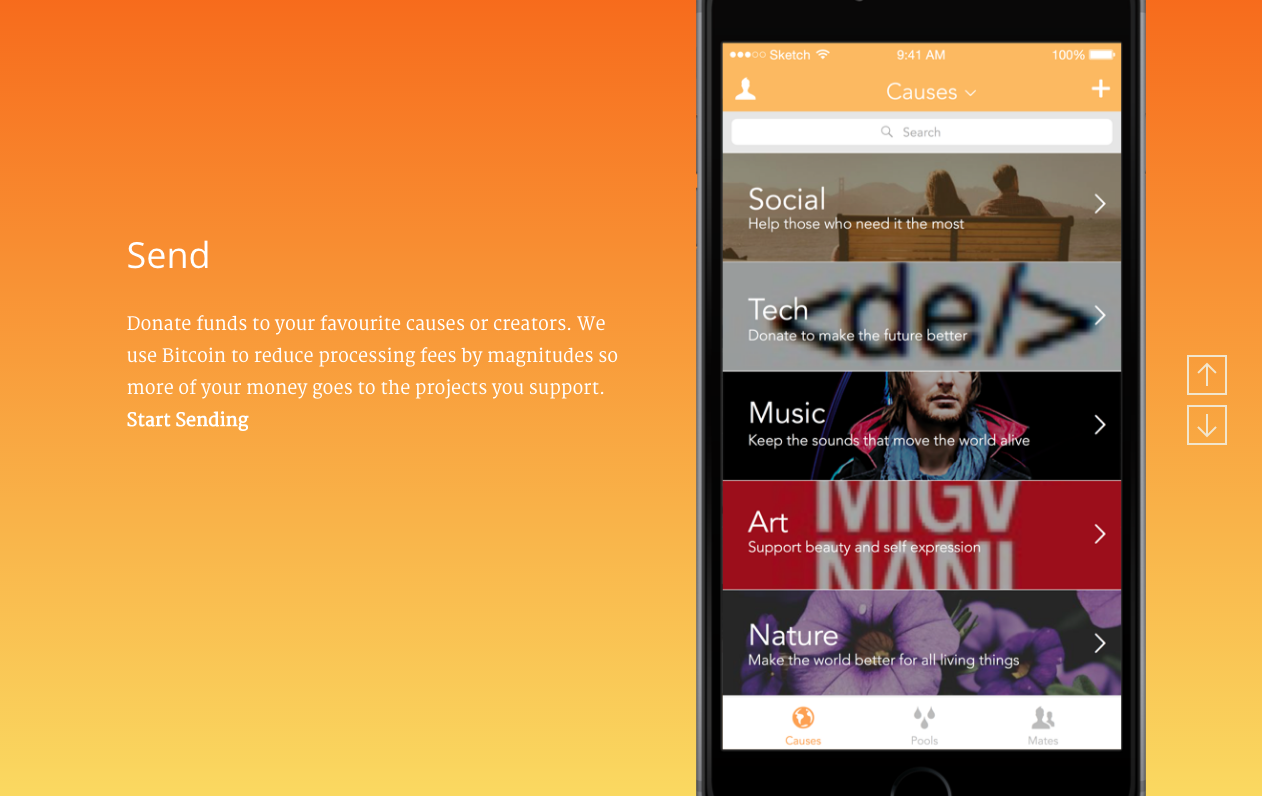
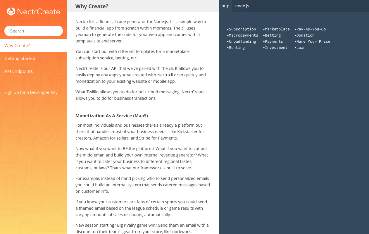
Using Bitcoin to create better financial services. A full scale platform design, app design and development, api architecture, and branding project.
Read Case Study
Helping designers find work. Using IFTTT and Zapier to prototype a simple real world service.
Read Case Study
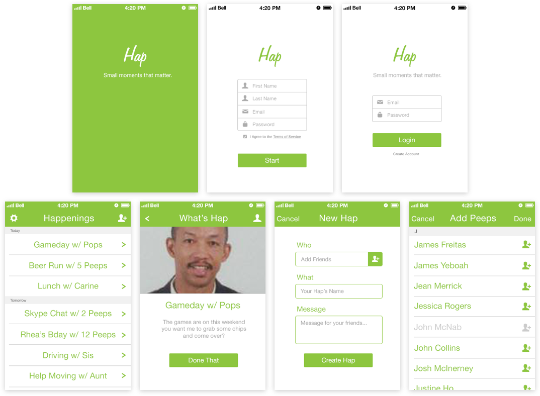
Make every moment count. Scratching an itch and designing and developing an MVP that makes it easier for friends to get together.
Read Case StudyCreating a simple app for all ages with fun in mind. Designing, developing, and managing a mobile game studio project for the first time.
Read Case StudyNeed help with your product?
Creating the Apple Music for hiring tech talent
While working on Nectr, I met Arjun and Pratik at a meteor.js meetup. We swapped stories and talked about what we were working on. They had a very simple mvp that had video demos of their idea to turn the hiring process from a resume scraping exercise into one about finding the right culture fit. I was busy at the time but a year later they contacted me about redesigning their webapp.
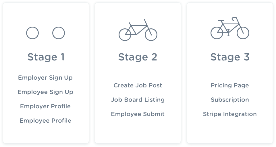
I had an initial meeting with the two founders and we talked a lot about what they would need to launch. They'd already invested around 5 years into launching the product but had stalled a few times with actually launching something that customers could pay to use. So we had a few skype calls and set down some basic features needed to launch and created a simple timeline for implementing those changes.

From there I was able to start creating wireframes and an Invision prototype to include the two founders in the design process. After getting sign off on the wireframes I was able to quickly create the high fidelity version as well. The design pattern I used was based on Spotify and Apple Music. Both sites do a great job of highlighting their talent and making them really appealing to music lovers. My idea was to bring the same concept to the hiring process. Since companies are looking for top tier talent, why not let job seekers present themselves in a way that allows them to show off their best skills and their personality like superstars.

On the other side job seekers are looking for the best companies to work for in the same way that music artists want to work with the best labels. That makes it a matchmaking challenge where the top talent and the top companies are really looking for each other, but they have a tough time sifting through the mountains of companies and talent pool to find each other. So I applied the same design aesthetic with the concept of making it easier for the businesses that people really want to work for to highlight themselves that way.
Overall the founders had a really great idea of making the hiring process easier for both sides by using short video pitches and clean design. After finishing the redesign I developed the new UI in the Ruby on Rails web app. At the time that I stopped they still needed their backend dev to create the Stripe integration. My last task was to create the pricing pages, but unfortunately I had to step away to focus more on my full time job. The last time I checked in the founders were doing meetings with potential partners and investors, but had made progress with onboarding Blue Ant Media as one of their first clients.
Learn Tech skills for free at your own pace
In the summer of 2010 I started trying to learn coding through the internet on my own. At the time it was a very difficult because there were no major online schools or coding tutorial sites that were made for the modern web. There were sites like w3Cschool and the Mozilla developer docs, but nothing that was well organized or with a great user experience. So I thought it would be great to create a website that made it easier to learn anything.
I spent the next couple of years working on the concept called automanik. I was trying to figure out how to design a great experience that would make learning more accesible and easier for people to find the topics that interested them online. The model I was looking at was a Google for learning. I wanted to make it easier for learners to find the best articles blogs and content that suited their learning style. I talked to friends and family about the concept and got some very great insights. A big one that came up early on was YouTube's value as a great place for learning. I thought that was
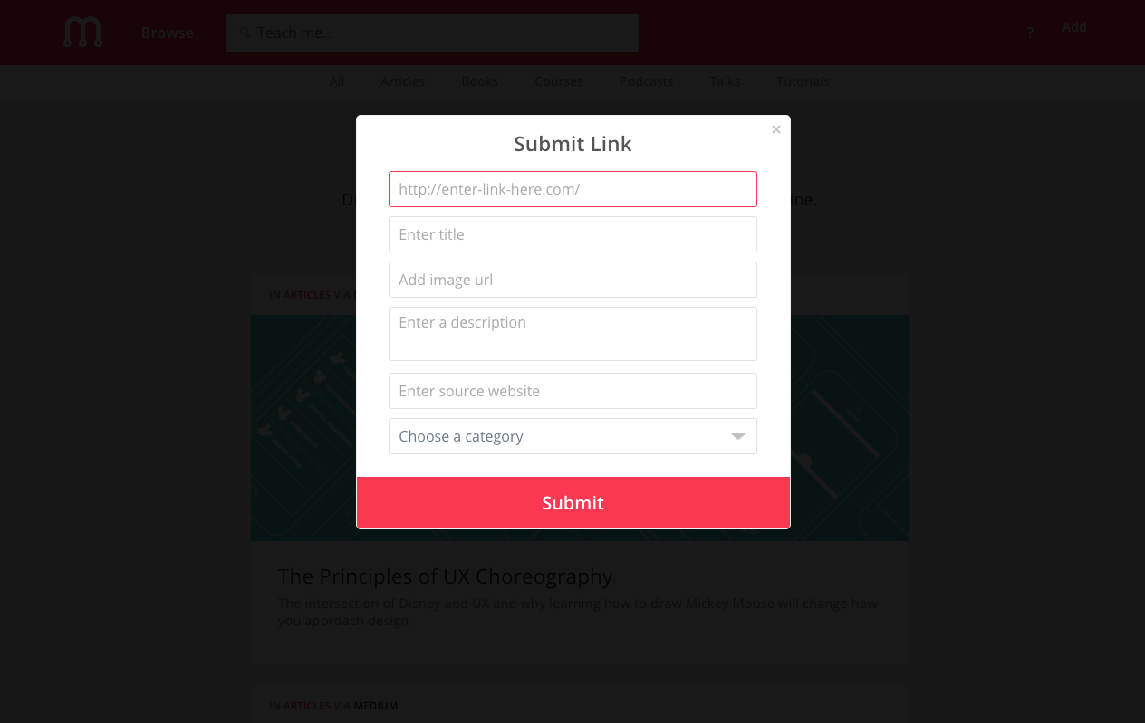
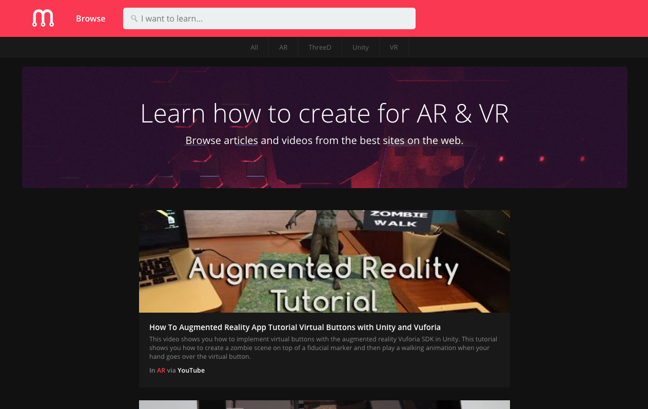
A few years later I was working at Modu Design and had free time to work on my skills. So I decided to take the time to learn to code by building the site. By this time I had already designed a new version of the site called Peruse, which I then changed to Madrasa. I looked at it as an interesting way to brand the site with a name and scheme that had some interesting cultural history behind it. This was the first version of the home page that I prototyped using HTML and CSS:
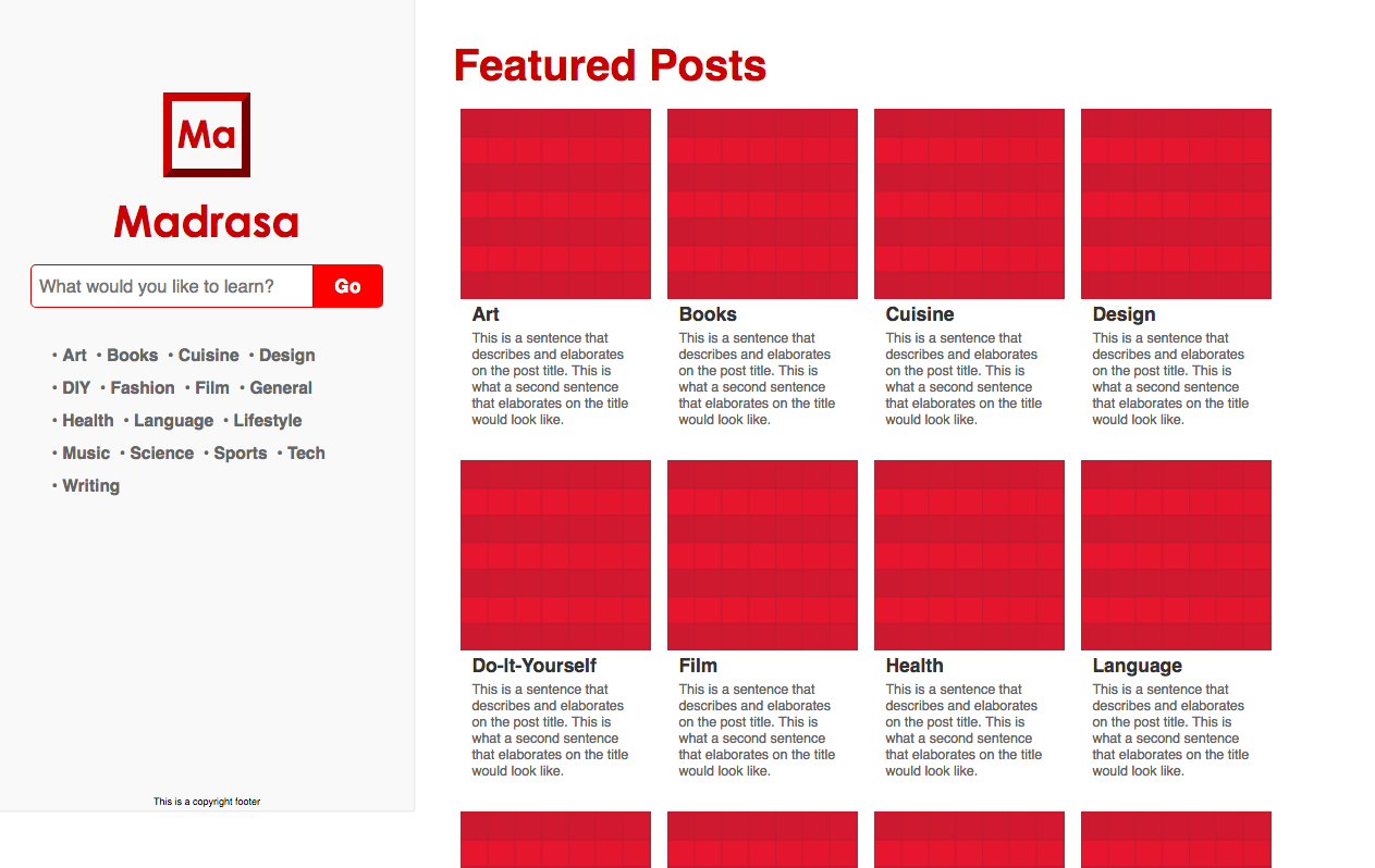
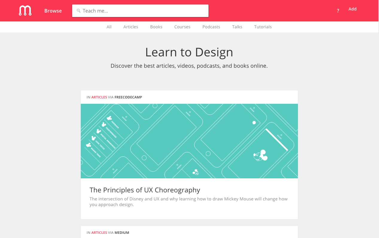
Since starting a few years ago many sites have popped up that have done a really great job of tackling the problem in interesting ways. One thing that I missed on was focusing too much on the niche and not enough on the tool. The real value comes from the ability of people with knowledge to share having the tools to share that knowledge. YouTube covered the ability for people to learn from video, Medium came later and has captured a lot of the text based learning on the web, and there are various sites that have looked at interactive lessons. The best sites for learning aren't learning focused sites, but tools that also allow people to use them for creating educational content. They don't try to force learning but make it easier for people who want to share their knowledge to do so in the medium of their choice.
I tried too hard to aggregate content to make it easier to find rather than making it easier to create and distribute content in a format that would be really appealing to a certain type of user persona. Another way to attack the problem would be to focus on one niche and one media type would be more beneficial than trying to aggregate a wide variety of content types and categories.
What the hell does innovation really mean?
Innovation is a magical word. Just the sound of it makes managers and employees alike giddy with excitement. It makes CEOs feel like champions, investors feel like oracles, and customers feel like VIPs. When the "I" word gets thrown around people get warm and fuzzy feelings of creating the future. What Launchboard set out to answer was, how do you actually quantify this?
They're platform was focused on taking the idea of a digital suggestion box and making it an actionable way for companies to actually gather, track, and launch great ideas from their employees. When I got there the prototype had already been built and was ready for potential users and companies to start using. Unfortunately it looked like this:
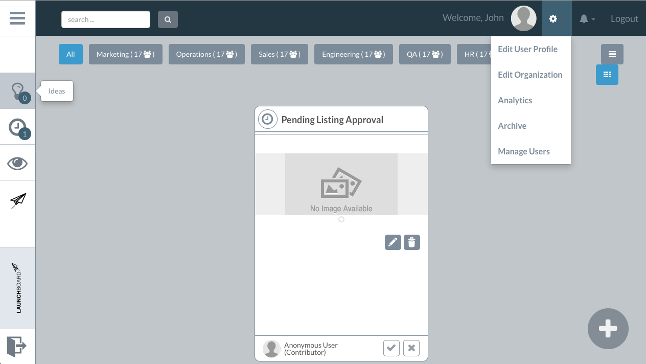
My job was to take the current site and make it something that was really appealing for managers to try with their teams. One of the big hurdles for organizations is that adding in new software becomes a very arduous task of getting buy in. This means getting approval to add it to the companies workflow, talking with different potential stakeholders to discuss potential benefits and pitfalls of adding this new tool, reviewing the budget and making sure that the value was there for the cost, and then finally getting everyone onboarded and using the software. My job was to redesign the web app to make it easier for managers to sell the idea within their companies.
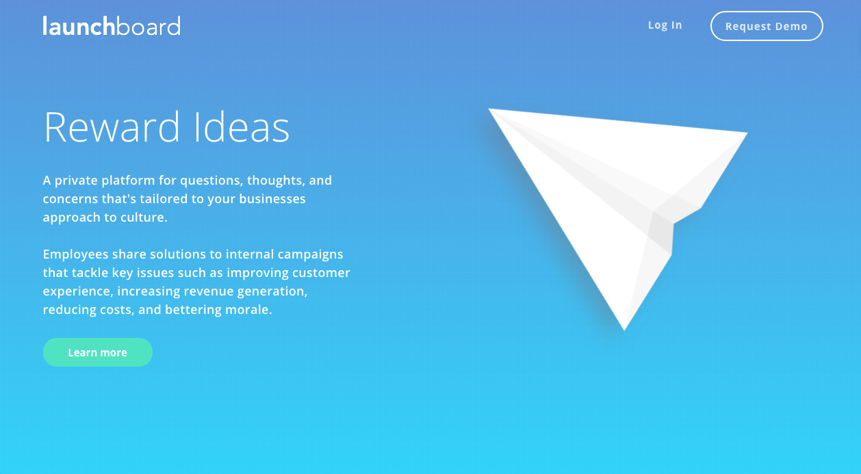
The intial theme that the app was built around was launching ideas. The only connection to this was that the logo was a paper airplane. I decided to push this concept further and redesign the entire UI and branding with the app being a cutting board for ideas. The good ideas would be slowly developed and refined until they took flight, while the bad ideas would be crumpled up and thrown into the trash. With this theme in mind I redesigned the ui to look like a real cutting board with a grid pattern and added in a "paper ui" to create the feel of composing and refining ideas.
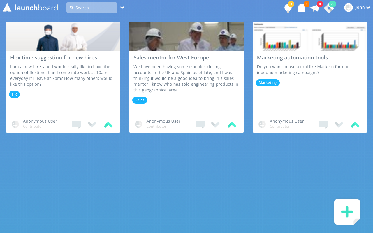
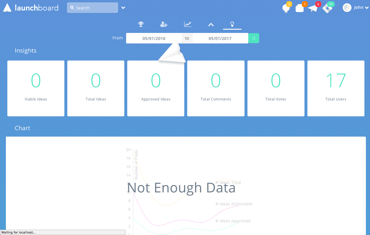
I also developed the UI for the Ruby on Rails app using HAML, SASS, and Javascript. I even was able to create a very simple loading animation that used the paper airplane logo flying in a circle to add a fun interaction to the app. If I had more time to work on the project I would have spent more time refining the admin UI to make it lookg more polished. I had some difficulty trying to wrangle the app setup into something simple. Thankfully with some effort I was able to get the ui very close to the actual designs in Sketch.
Experimenting with new ways of sending money
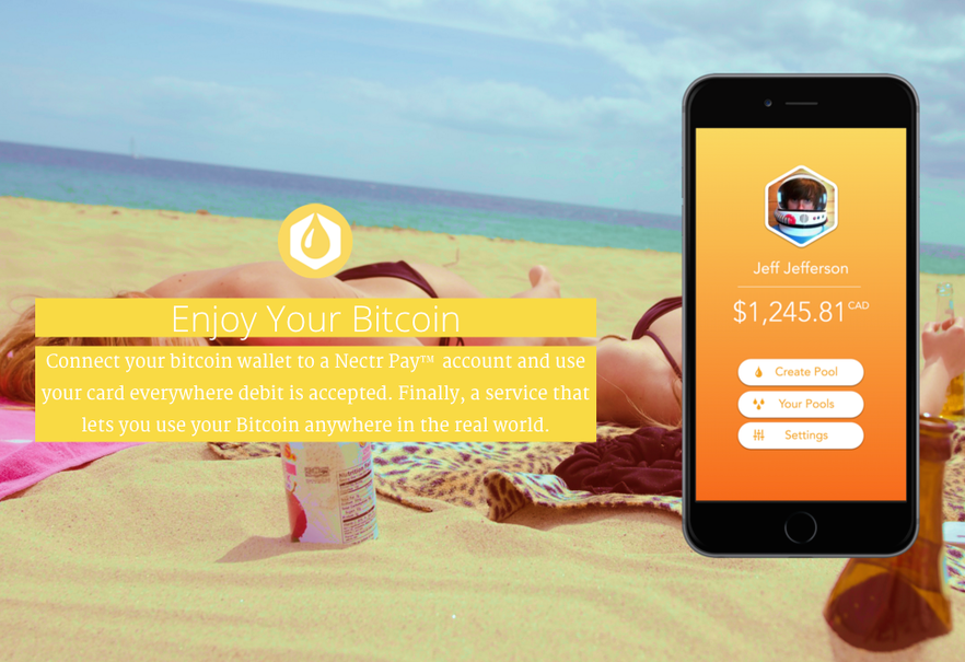
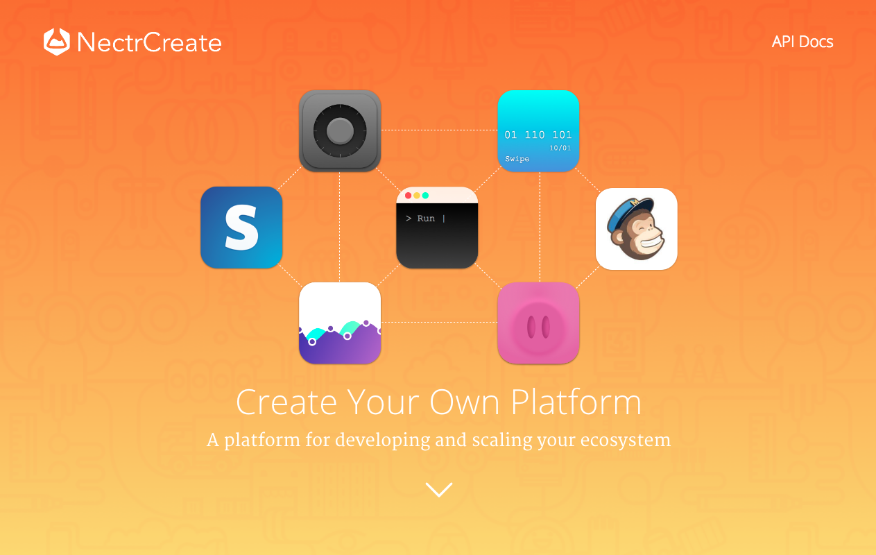
One of the industries that I was interested in working on was finance. Its a very old industry that has seen a lot of change but is still stuck in a very old way of doing things in many of its processes. One of those processes is how customers money is handled and how they're actually able to use it. We sought out to tackle this question and figure out if Bitcoin could be a technology that would make the process cheaper, faster, and provide more benefits to customers in the long run.
See it in action at Nectrtech.com
Creating a bot to help designers find jobs
A few years ago I was just beginning my journey in tech. I wanted to spend some time learning how to create an mvp that I could use to guage interest of potential users. One of those ideas was a bot to share jobs with designers. I had a lot of fun and was able to create a really interesting concept of how to connect talent with the jobs they're looking for.
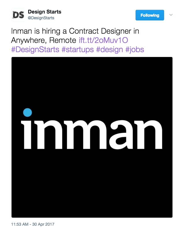
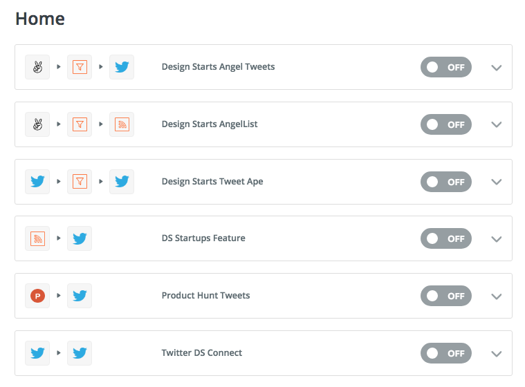
Putting together the bot was surprisingly easy. The real challenge was figuring out how to curate the content in a way that would increase engagement and grow the followers. Using Zapier and IFTTT, I created different zaps and formulas that allowed me to send automated tweets as the jobs were posted. I would then pull the jobs from places like AngelList and include the logos from the brands to make it more eye-catching.
In the end I stopped tweaking the formulas years ago but still check it to see how its doing. The crazy thing is that it has more followers than my real twitter account! Its grown from just around 400 followers since I stopped controlling it to almost 800.
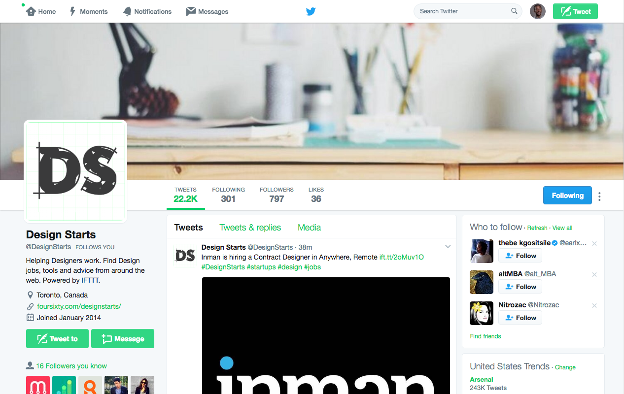
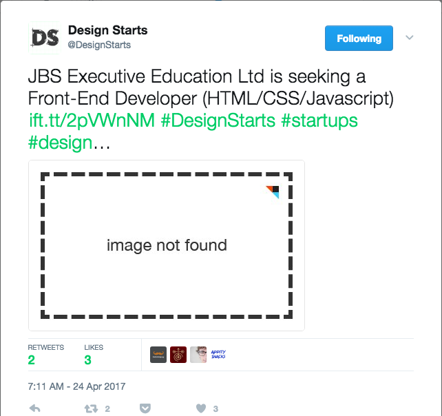
One thing I discovered was that tweets with broken images performed better than tweets with no image or tweets with nice logo. Another thing that surprised me was that the brand didn't matter. There were postings for jobs at Tesla, Dropbox, and other big brands that received no engagement while jobs from small companies would receive up to 5 likes and 2 retweets. Basically the "what" mattered more than the "where".
The one thing I would have done differently was more testing around the content types. I stuck with posts from just the initial sites that I used but users I talked to recommended filtering by location and job type better. Also when I had the time to run it I also reached out to designers to feature and share their work which they really appreciated. It would be really interesting to take this idea further and create a job recruitment bot for designers through facebook messenger.
See it in action at @DesignStarts
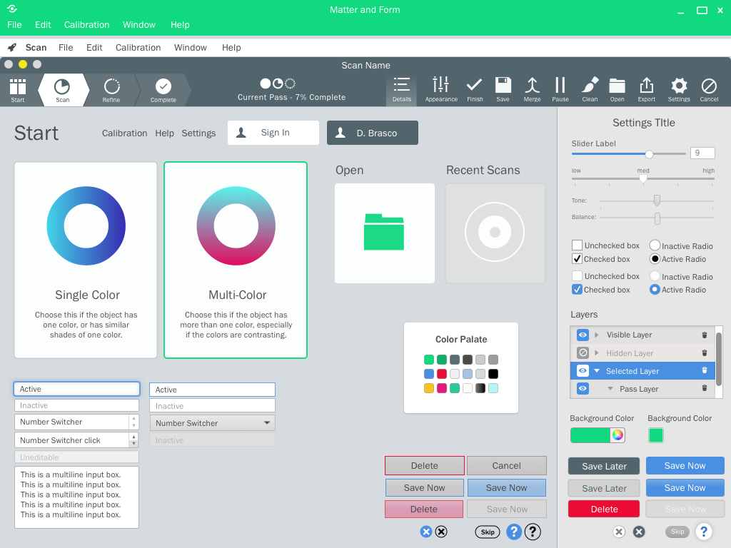
Redesigning hobbyists software for the average person
Building a social app that actually brings people togther
Working on the video game studio really motivated me to try and make more apps. I had a lot of fun and more importantly learned so much about what it really takes to create an app. In spring of 2014 I started designing the app and creating documentation to use as a starting point for how the app would be created. One of my friends pointed me to some places to find possible collarborators on the project and I interviewed a few and started working with them.
Both developers were exchange students from Brazil who were interested in working on a challenging project that they'd be able to show off to potential employers. Felipe developed the java front-end for the android app and Joao handled the backend in python. I took care of designing and building the Android UI in xml, and creating the HTML, CSS and JS landing page.
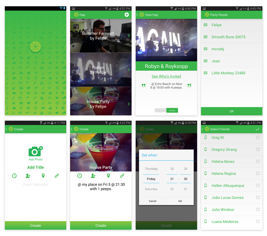
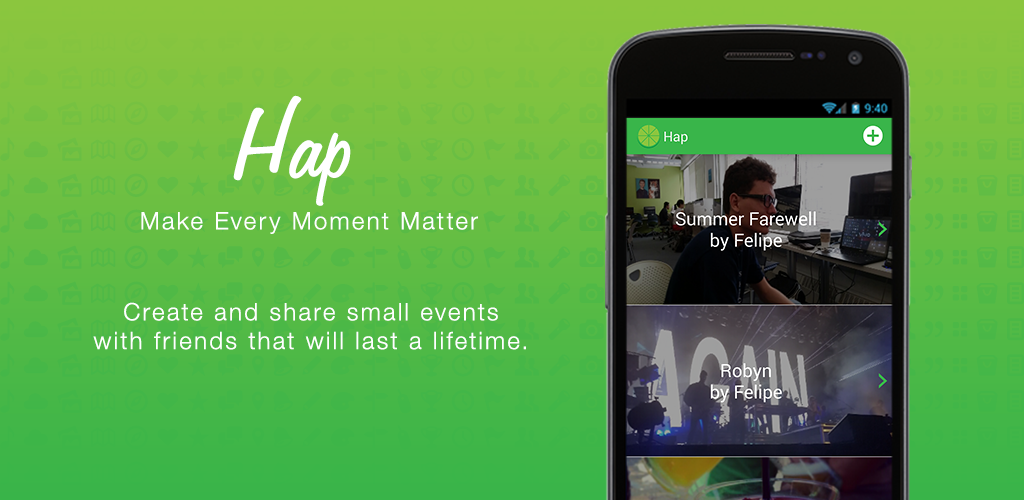
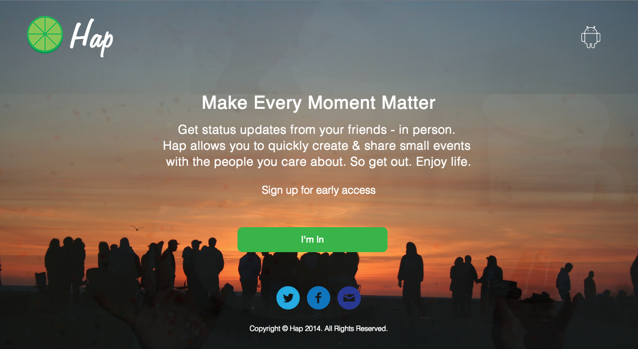
It takes a lot of work to make something really fun
Making a game is really hard. It sounds obvious when you think about it, but sometimes its better not to know or to ignore how difficult somthing might be. If my cofounders and I had known how much work it would be we might not have started at all.
Instead we jumped right in and created the concept, hired a team, fired some of them, applied for grants, learned about marketing and selling apps, the list goes on. In the end, despite a slew of mistakes, we were able to design, develop and launch a mobile game, get some press, and even a few hundred downloads.
While working for him at a health care startup, one of my co-founders had a cool idea to create a mobile version of Mario Party and Super Smash Brothers. Both games were hugely popular when we were growing up and we realized that there was huge interest on Reddit and internet forums for classic Nintendo games. The problem was there was no way we'd be able to get licensing rights from Nintendo to create it. We were a small studio with no pedigree, bootstrapping the whole way. So we got creative.
I started doing domain research and looked at what some of the other top games on the app store were doing. One of the trends that were popular at the time were games with animal themes. It hit me that we could use the Zodiac signs as characters that would mirror Mario Party's roster of characters. The concept was within fair use and would allow us to create the game concept without running into copyright issues.
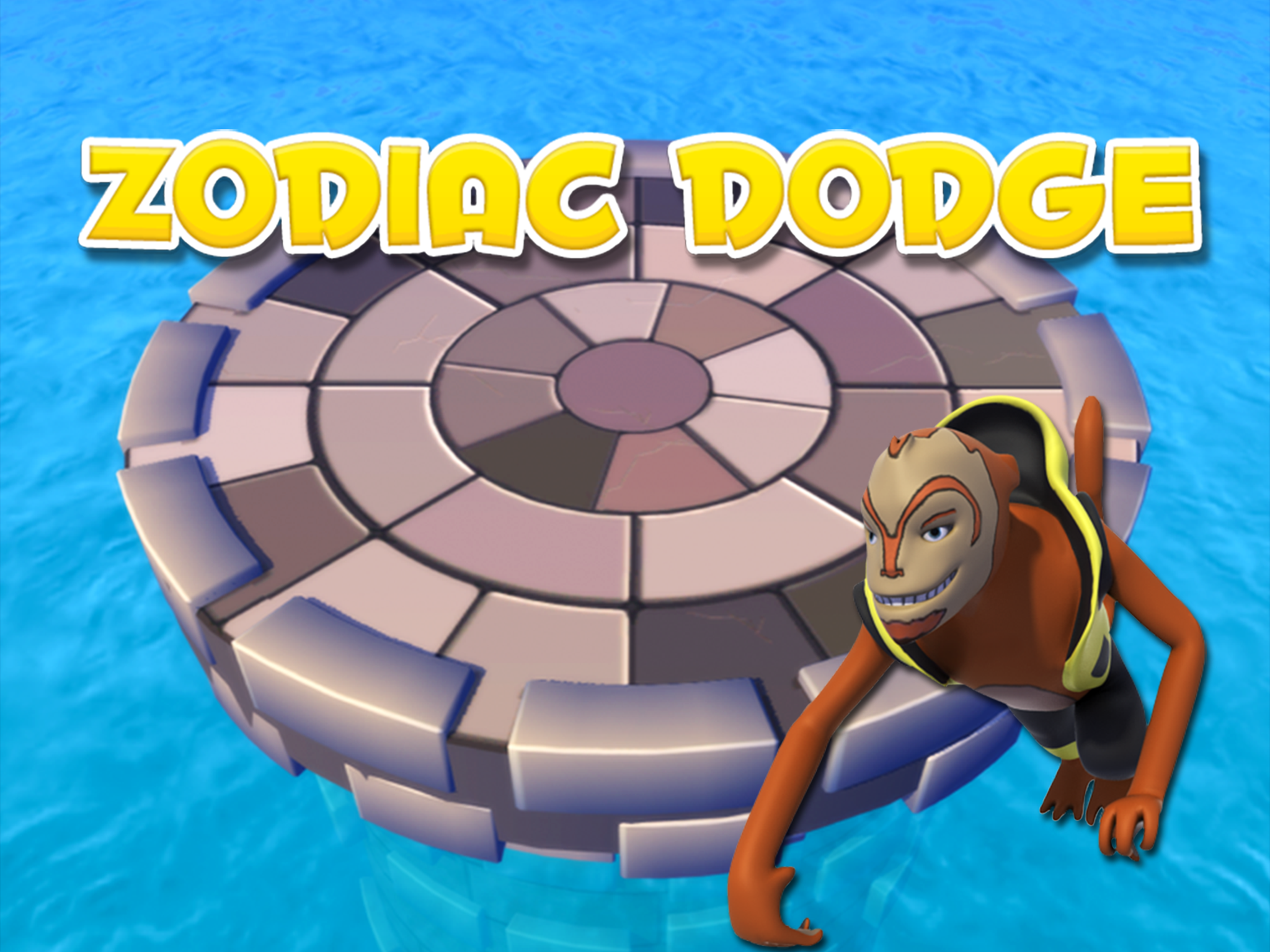
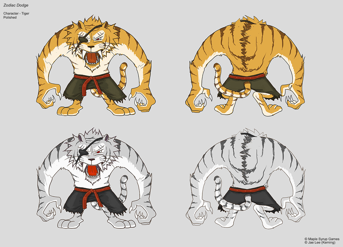
We we're fortunate to find a talented illustrator Jae Lee to create the concept artwork. He was able to make the characters fun, interesting, and little badass too. There were numerous versions that we went through and Jae Lee was really adept at taking our rough direction and turning them into fun and life-like characters. Where we really ran into challenges was around the actual development of the game. We started out with a concept that was too similar to Mario Party. The size of the apk was too so large that many of the devices we tested on at the time couldn't handle the performance load. We made tough decisions to keep the game to only the top iOS devices at the time, which would limit our ability to reach the widest possible audience. The biggest choice was scaling the game down to one mini game that we would launch to have a game that was smaller to download, ran faster and was easier to develop at a higher quality. This meant our concept art was useful but the actual game concept changed drastically from our starting point all the way to launch. We took our testing with users and our benchmark tests with devices and applied them as much as possible to make sure that what we launched would be good enough for us to stand out from the crowd.
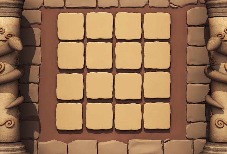
After a month of concept development we started hiring more of the right team members to develop the game. We had Nathan one of our 3D modellers start creating the initial versions of the characters. He was able to work at an output of around 1 character/iteration per week. It was a very time intensive process to go back and forth with him and some of our initial modellers, especially since we had them working remotely to save time on travel and because we didn't have enough desks to be able to have them there 9-5. We actually had a number of modellers we worked with but we ended up sticking with just Nathan for the early stages of the project.
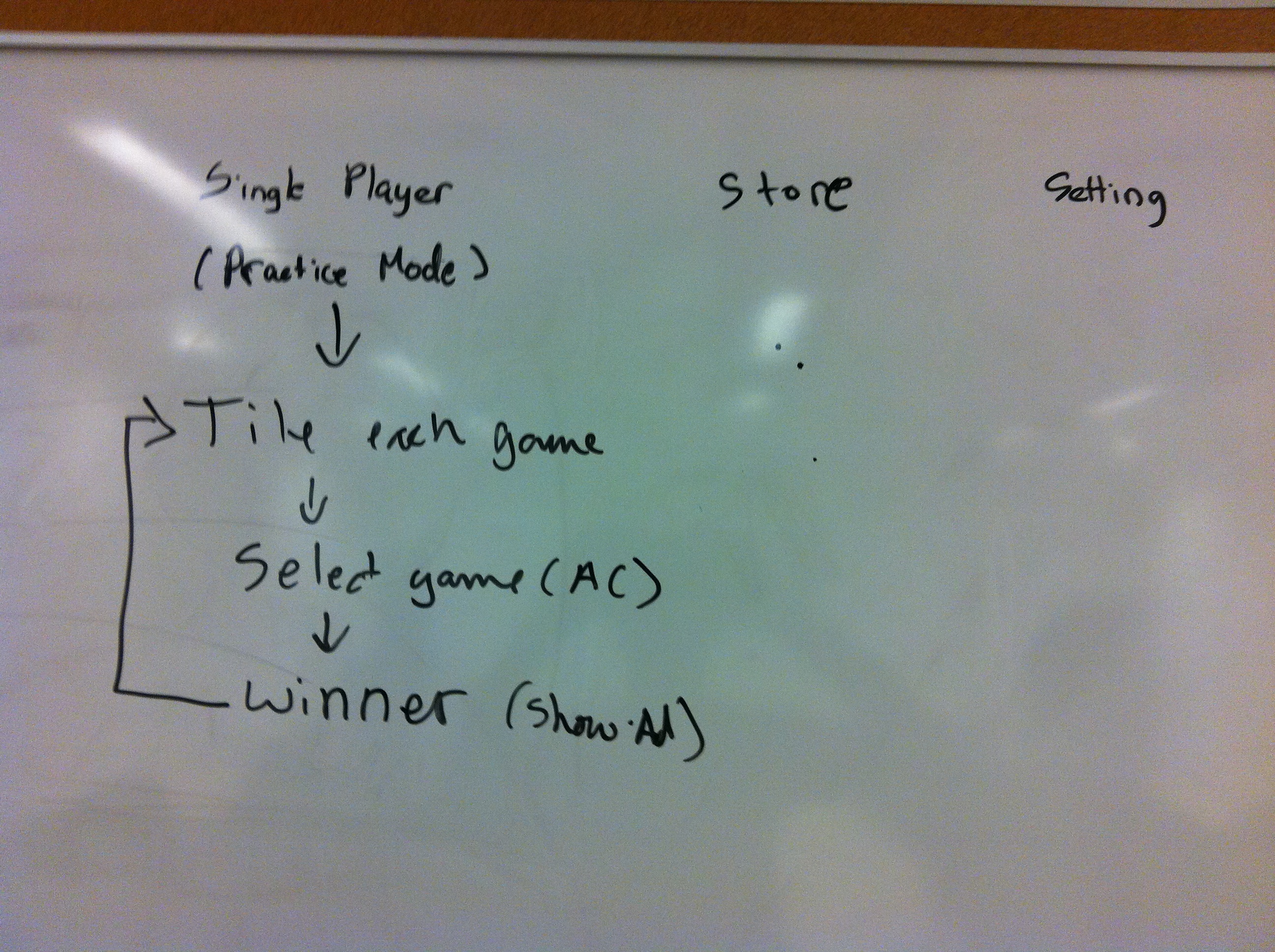
Thankfully we were lucky enough to find 3 more talented people to join the team. Jeff Martin was our best 3D modeller and did the majority of the final renderings of the 3D assets and did a great job of simplifying them for the final game. We tried to hire a couple of developers but Justin Sawchuck was our only reliable developer and he completed 100% of the development work that we actually shipped. He setup the bitbucket repo, developed the different stages of the prototype, worked with me to handle QA, and overall made sure the pipeline between himself and the other team members was efficient. Our final key member was Jilian, our animator. At the time we had looked for a few months for the right person and she was a great fit. She quickly animated the characters in different styles and was able to make the process move along a lot faster. After months of work and some setbacks with hiring additional team members we ended with this same team and I took care of the marketing collateral for the AppStore screens, the appstore developer contracts, and the provisioning of the prototypes and finally the apk for public launch.
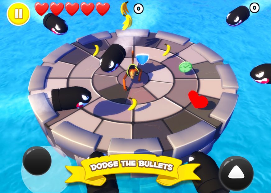
Here's a gameplay video of the final game below:
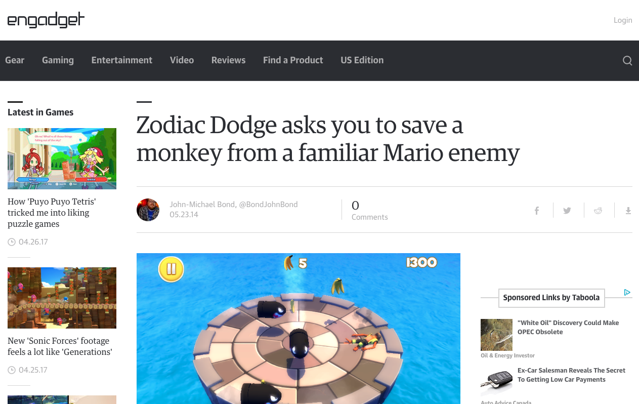
I learned a lot during the 4-6 months working on the project, most of which wasn't visual design. The company needed someone to take on a creative leadership role and so I picked up the slack around that. My overall job was to lead team of game artists and developers that created Zodiac Dodge mobile game for iOS. I came up with and led the creation of the Zodiac concept and designed the UI and branding for the game. I also handled the hiring of the team throughout and managed the creative team remotely. I'm most proud that I was able to successfully manage the launch of game to the AppStore and got press in Engadget. Real artists ship and I'm proud to say that I've done that.